
Phil Pan is a user on YouTube who gave this information on the grey card. Fortunately for us, he has worked in professional imaging technology for about 35+ years. Also, he has been a photographer since the 1970s.
What about the Grey Card?
18% grey cards are designed to provide a formal exposure based on the fact, ‘that 18% reflectance equals 50% of the brightness function in the healthy human eye.
Phil Pan, Imaging Technology Professional
In photometric colour science, 18% reflectance (18.42% in fact, which corresponds to an optical density of 0.7347), is spank in the middle of the tone scale — it is “Middle Grey”.
The entire nomenclature of photographic systems normalise to this standard —
ISO numbers calculate the amount of light energy needed to produce “Middle Grey” on a particular imager or film. The calculation is absent of variables such as sensor/film area, aperture and shutter speed.
Thus, an ISO of 400, on a particular film stock or digital sensor, matches exposure on an imaging device rated at “ISO 400”.
A grey card just for exposure then?
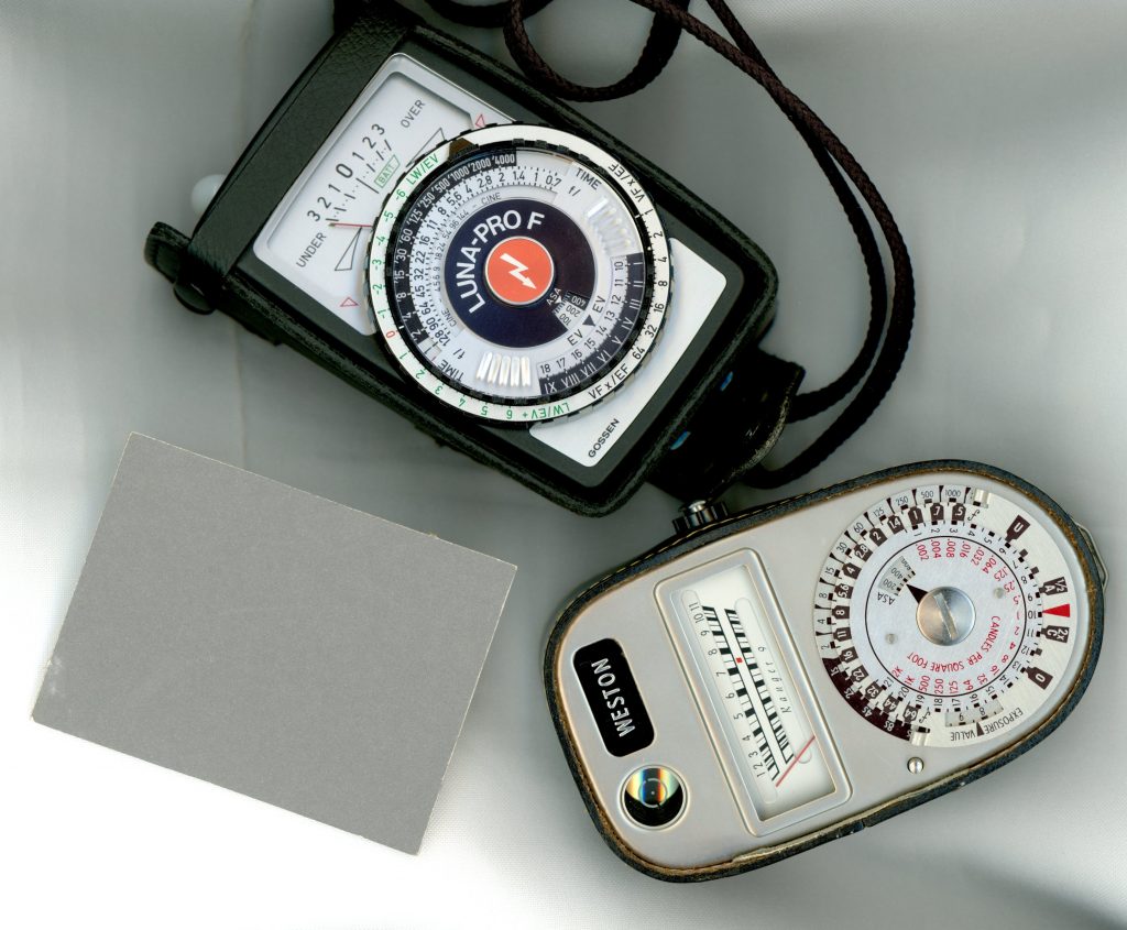
You’d be right by stating that its initial intent is to give a correct exposure from a reflective/spot meter reading. Largely, because photographic exposure meters calibrate to an 18% grey reflectance standard.
Yet, in an tri-chromatic (3 Colors) reproduction system (RGB or CMY), the grey scale is always the exact blending of the three colour channels.
A pure Grey card will always represent the perfect mix of the three component channels. Hence, a grey card isused to neutralize color (so-called “white balancing”).
Let’s head to the hardware store for the bucket of grey paint to make a grey card.
This isn’t a good idea. Understand that only specially formulated black ink or grey paint will produce “neutral grey” under any type of lighting. Sadly, the “grey” that you would get from the local paint shop won’t appear pure grey in different lighting conditions (skylight, tungsten, fluorescents, and so forth).
Professional grey cards remain neutral under various lighting conditions; meaning, they are “non-metameric”.
Moreover, while an 18% grey card isused for white-balancing, it’s more customary to use a lighter shade of grey (usually one or two “zones” above, or a reflectance of 37 or 74% — zones VI and VII, in Ansel Adams nomenclature).
The only reason to use lighter shades of grey is because they would exhibit less grain or noise than mid-grey when reproduced, and hence measurements of their reproduction would tend to produce less noise-based errors.
Phil Pan, Imaging Technology Professional
How to use a color chart?
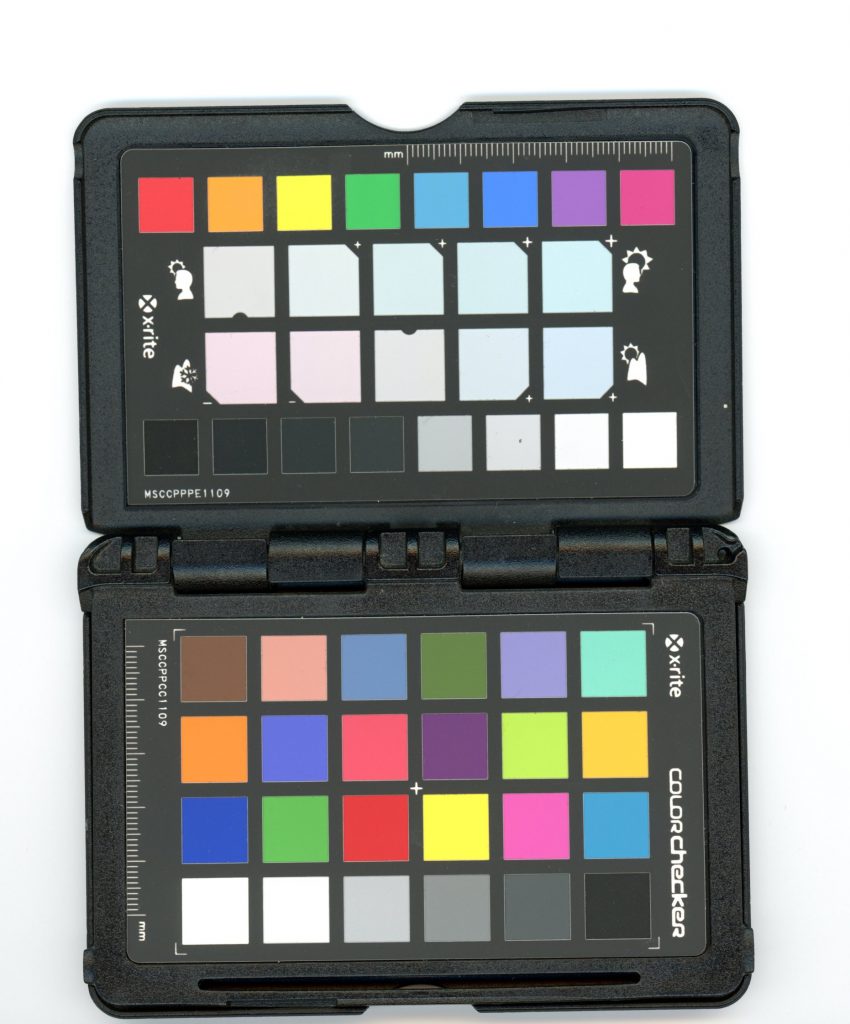
The Macbeth ColorChecker by X-Rite is not used for white balancing, but it is used to correct the gamut and metamerism (think pixel pattern) of the film/digital sensor colour filter array (aka “Bayer Pattern”).
Camera systems are designed to emulate the spectral sensitivity of the human visual system. This is something that different vendors are more or less capable of.
As a result, the way a camera captures a scene doesn’t perfectly match average human vision. Also, it doesn’t match other camera systems.
To make this work, imaging software needs to be objective to camera capabilities. Primarily, it needs all images coming from any cameras to be somewhat neutralized to a standard way of “seeing” colors.
Alas the Color Checker saves the day.
The ColorChecker is used to assess the color distortions introduced by the imaging device. Moreover, this simple tool corrects them using complex, non-linear transformations on “camera profiles”. This is also called “gamut mapping”.
So, it aligns your camera with the optimal settings in your editing software. It is not, strictly-speaking, used to “white balance” your shots.
Except (!) the second chart on X-Rite's excellent little calibration chart. This chart has a series of very pale, off-white colour patches, that are either cool or warm.

The use these patches is to help users perform "off-white" white balance. The idea is that; pure neutral white balance is not always desirable for aesthetic purposes.

Clicking within your software's white balance sampler in these off-white patches will allow you to obtain white balance that has a warmer or a cooler cast. And, because the color casts are stepped "cooler or warmer" at regular intervals, this help you perform repeatable off-white balancing.
It makes so much sense, and it makes my images prettier.
I hope this helps you better understand the function of the Grey Card. I provided the Color Checker information as a added bonus.
To summarize- A grey card can be used to both define a approximate exposure by give the user a reference to a 18% reflectance reading of any subject.
It also can be used to white balance, because middle grey is the equivalent to mixing all of the colors in tri-chromatic color systems (RGB & CMY).
Lastly, a color checker’s primary patches function to correct the gamut & bayer pattern of you film/sensor using “color profiles” & “Look up Tables/ LUTs” to match the colored swatches on the card in your editing system .
How are you using these tools to help you create images in your project. Please comment below or in the group on Facebook. I’d personally love to hear and see your work. Now, go shoot something.
One reply on “How to properly Use a Grey Card in Photography?“